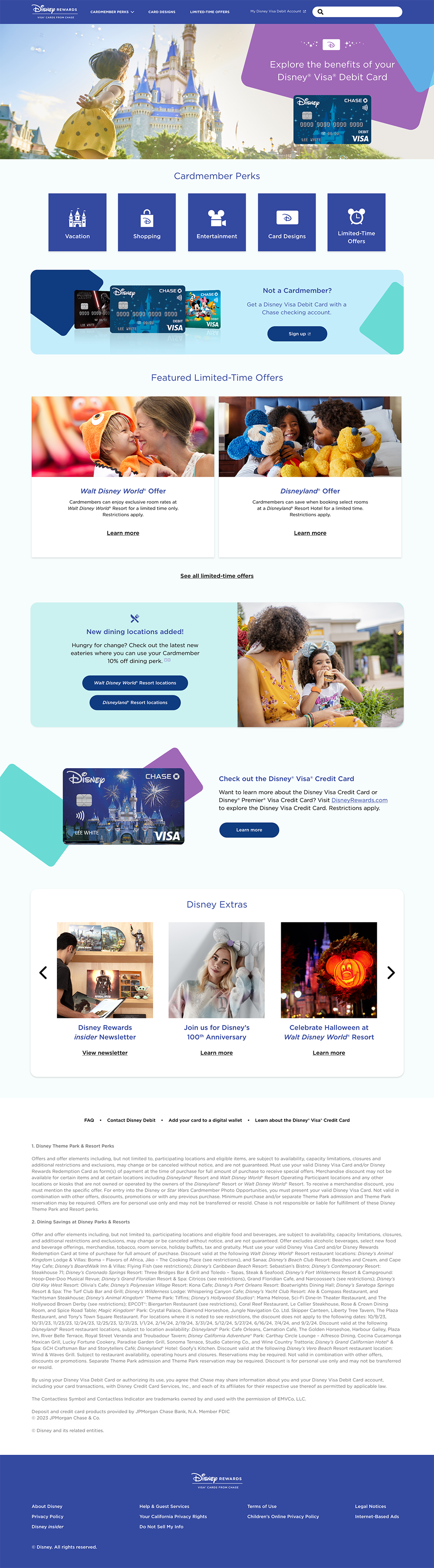
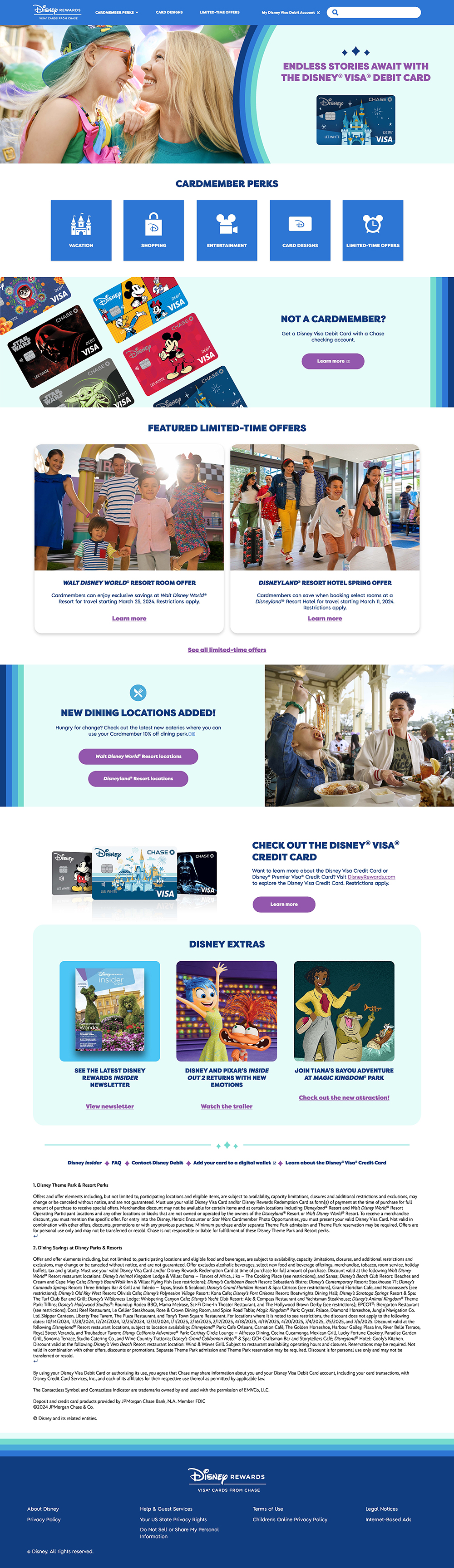
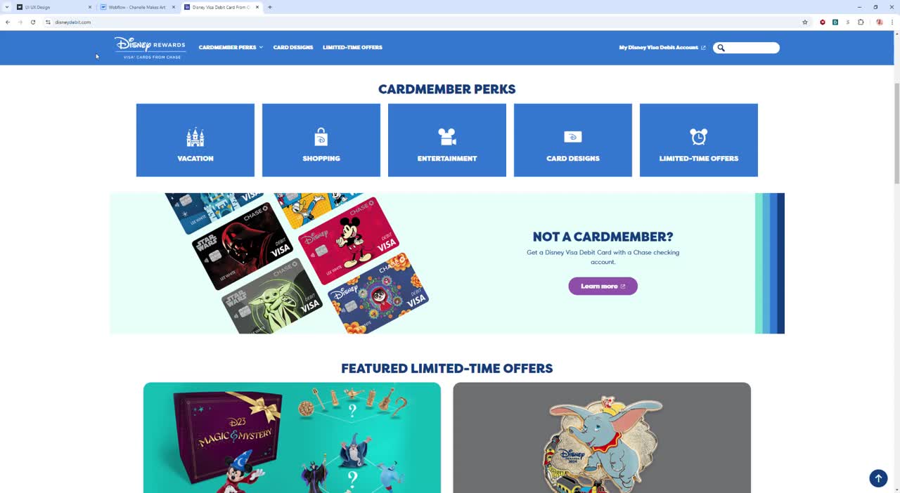
User-Centric Design: Create a modern and user-centric design that offers a seamless, intuitive, and enjoyable user experience.
Mobile Responsiveness: Ensure that the website is fully responsive, providing an optimal experience across various devices, including smartphones and tablets.
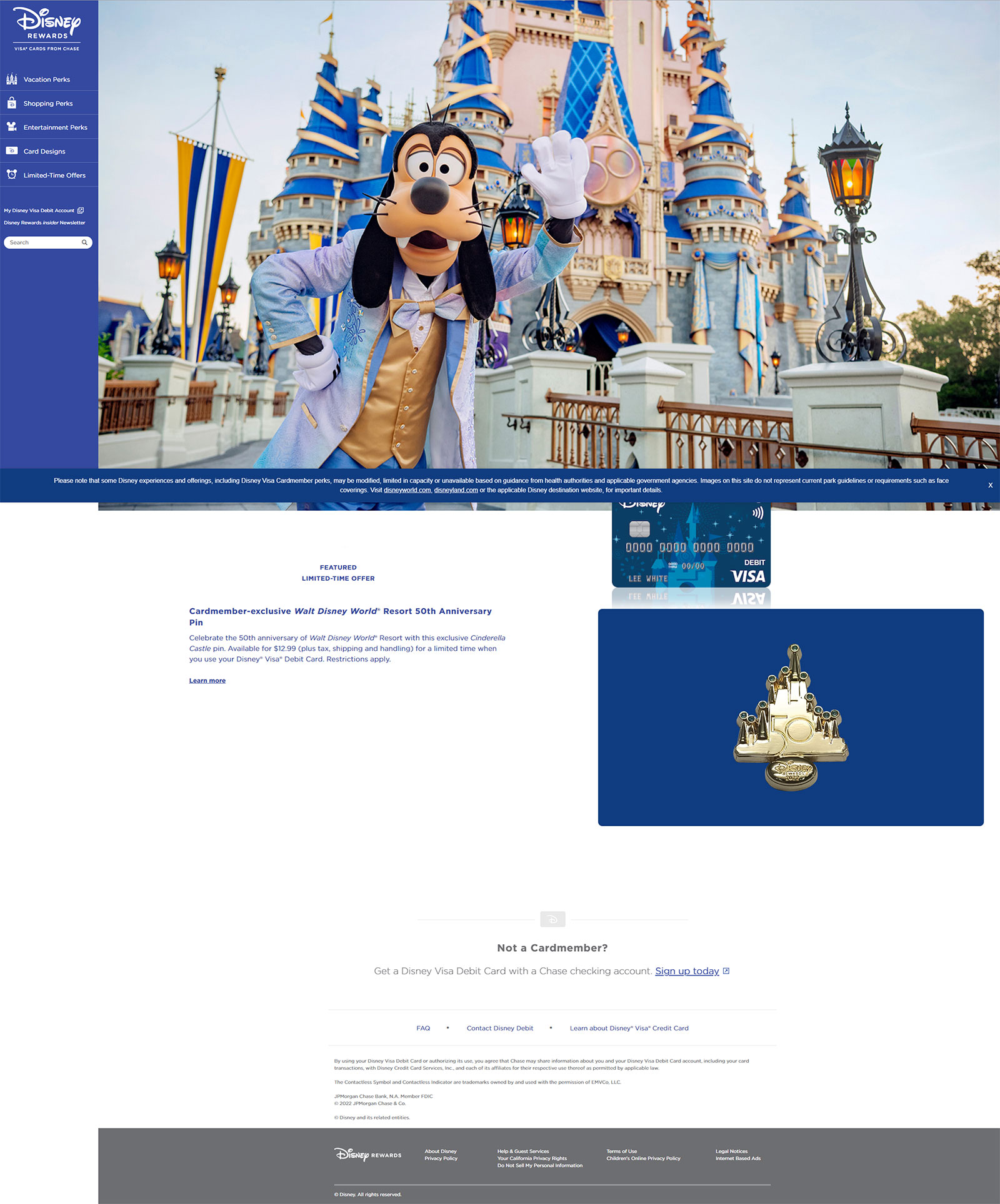
Disney Integration: Integrate Disney branding and content, including access to exclusive Disney perks and promotions for cardholders.
Performance Optimization: Optimize website performance to reduce load times and enhance overall speed and responsiveness.
Month 1-2: Requirement gathering, concept design, and initial planning. I used this time to create wireframes that would eventually lead to high fidelity mockups through constant feedback between client and development team.
Month 3-4: Development and integration.
Month 5: Quality assurance and testing. I worked directly with the development team to assure cohesion of designs
Month 6: Deployment and launch of the new website.
• Improved user satisfaction and engagement.
• Increased utilization of Disney-branded promotions and perks.
• A platform that aligns with Disney's brand image and values.
The wireframing process in the project to redesign the Disney Visa Debit Card website was a crucial step in the project's planning and design phase.
1. Requirement Analysis: Before wireframing began, it was essential to have a clear understanding of the project requirements. This included understanding the needs of Disney Visa Debit Cardholders, the features and functionalities required, and any specific branding or Disney-related elements that must be incorporated.
2. User Flow Mapping: I wanted to create a better experience for the users and have more accessible to them. For instance, users may need to access their account or explore Disney perks. This led me to focus primarily on the home page as it lacked navigation and promotional call to actions.
3. Sketching and Conceptual Wireframing: I started with rough sketches and conceptual wireframes that outlined the basic layout and structure of the website. These wireframes served as a starting point to visualize the placement of key elements such as navigation menus, content areas, call-to-action buttons, and Disney branding. I wanted to incorporate more of their card clusters to further emphasize the card details. I also referenced other Disney websites to integrate a cohesion of style.

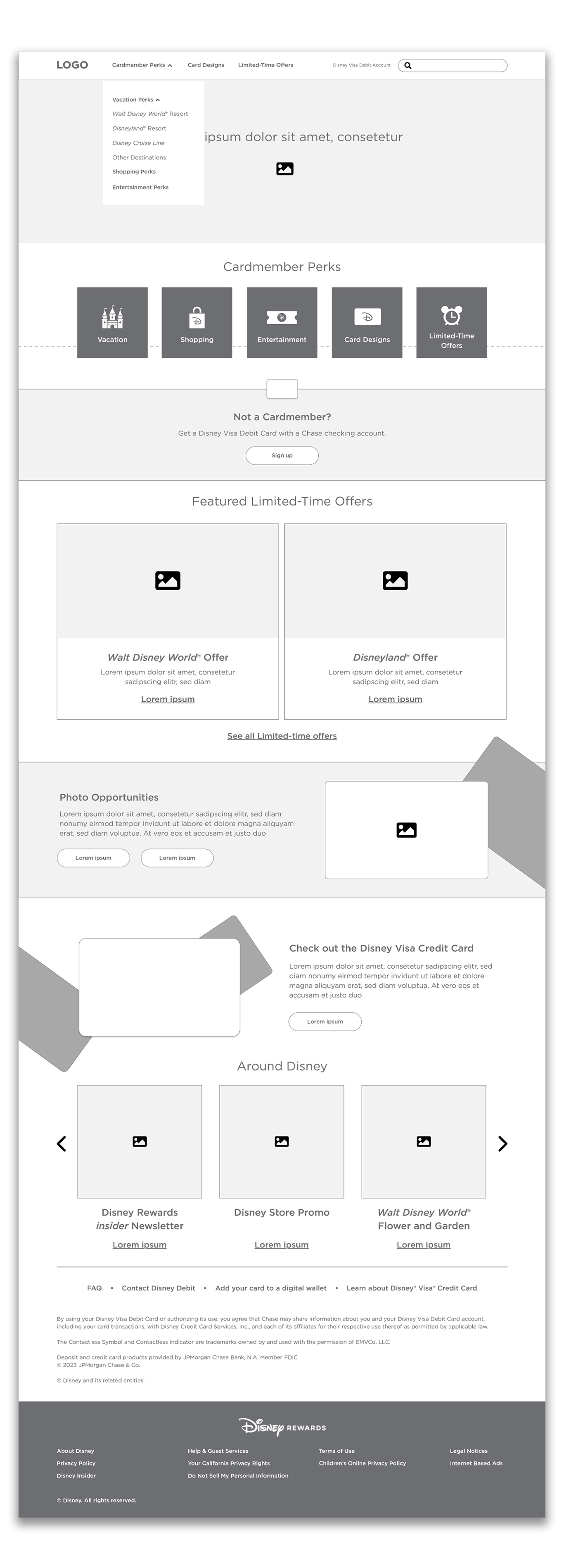
4. Detailed Wireframing: I then developed more detailed wireframes that include a comprehensive representation of each page's layout and elements. It was important to maintain a balance between Disney branding and functional elements.
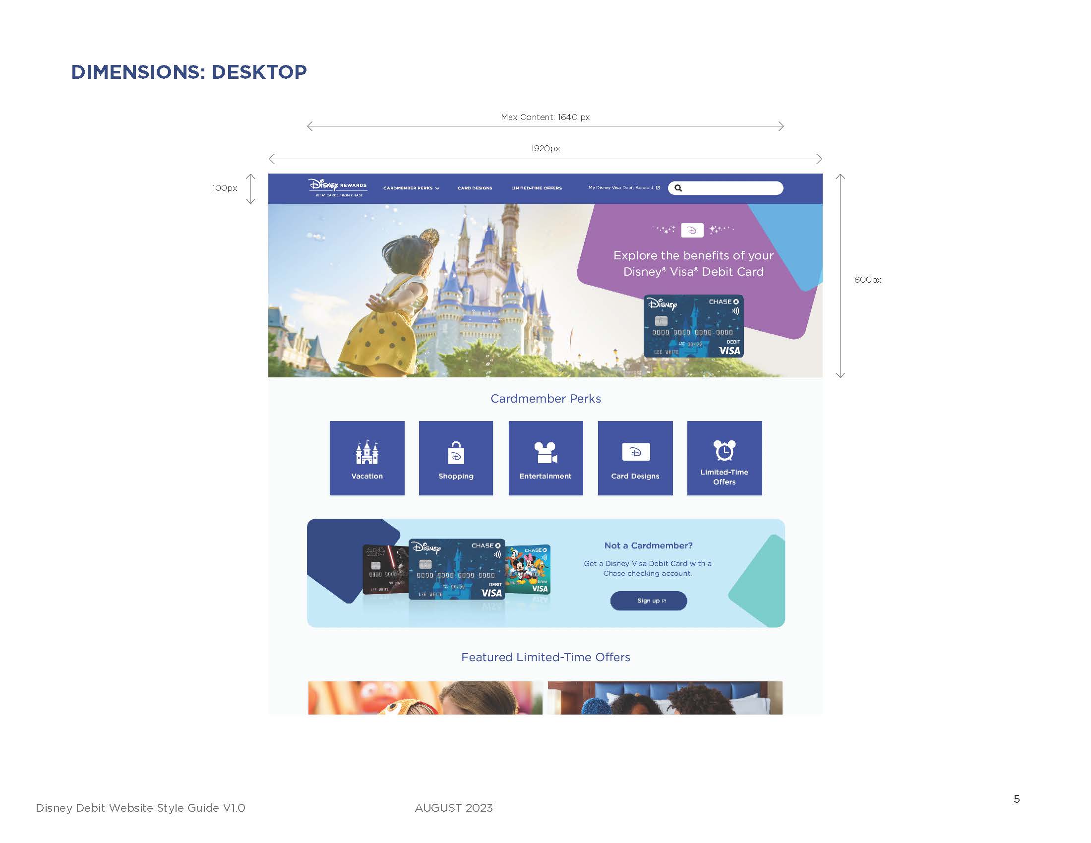
5. Mobile Responsiveness: I ensured that wireframes account for mobile responsiveness by creating separate wireframes for various screen sizes, such as desktop and mobile.
6. Iteration and Feedback: Share wireframes with c teams, to gather feedback and suggestions. Iterate on the wireframes based on this feedback to ensure that all requirements and design objectives are met.
8. Documentation: I documented the wireframes with detailed annotations and explanations for developers and designers to reference during the implementation phase. This documentation included specific instructions regarding colors, fonts, button styles, and other design elements.
9. Handoff to Development Team: The wireframes served as a blueprint for me to create high-fidelity mockups, and for the development team to implement the website's structure and functionality.
10. Ongoing Reference: Wireframes continue to serve as a point of reference throughout the project's execution, helping to ensure that the final product aligns with the original design and functional objectives.
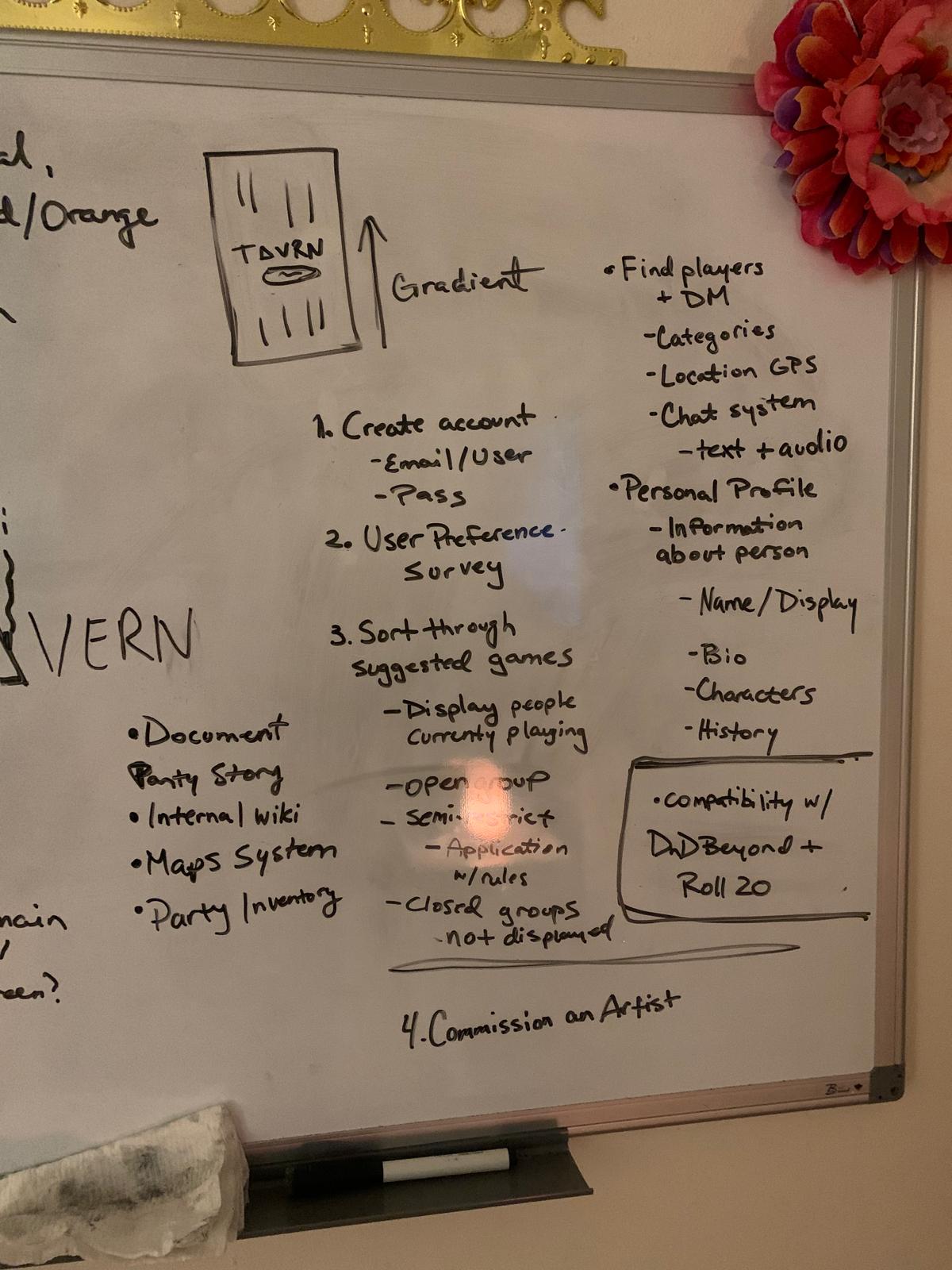
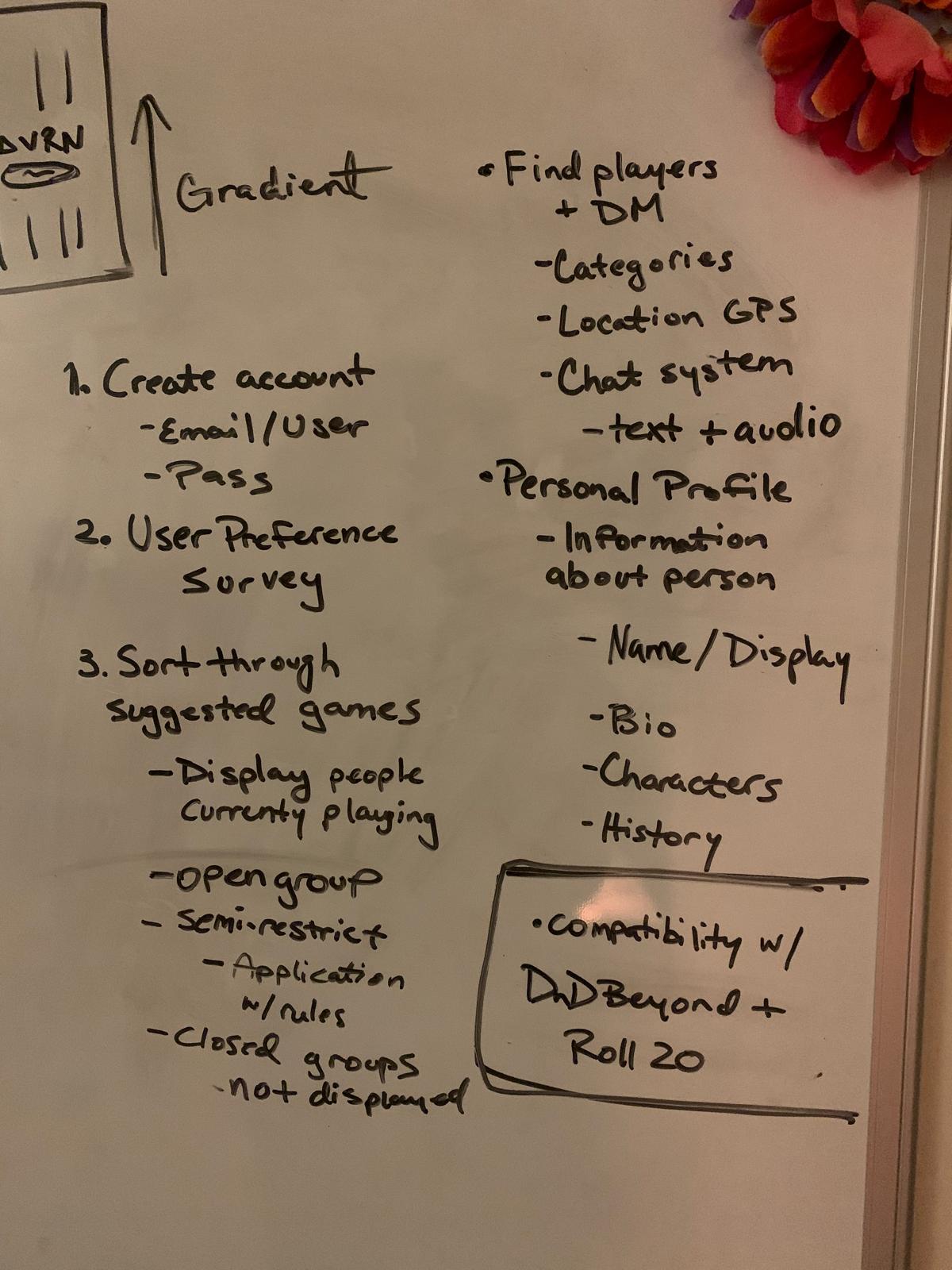
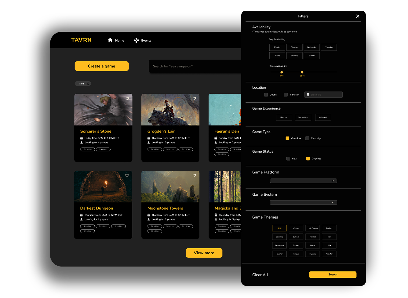
The research process for developing Tavrn was multifaceted and thorough, aimed at understanding the needs of the tabletop role-playing game (TTRPG) community and identifying essential features for the platform. I began by diving into existing game application processes on various forums and platforms to discern what information was crucial for players to provide when applying to games. This included examining common fields in application forms, such as preferred game systems, player experience, and availability. By reviewing these applications, I identified key data points that would be necessary for Tavrn’s user profiles and game management tools, ensuring that the platform would facilitate a smooth and comprehensive application process for both players and Dungeon Masters (DMs).
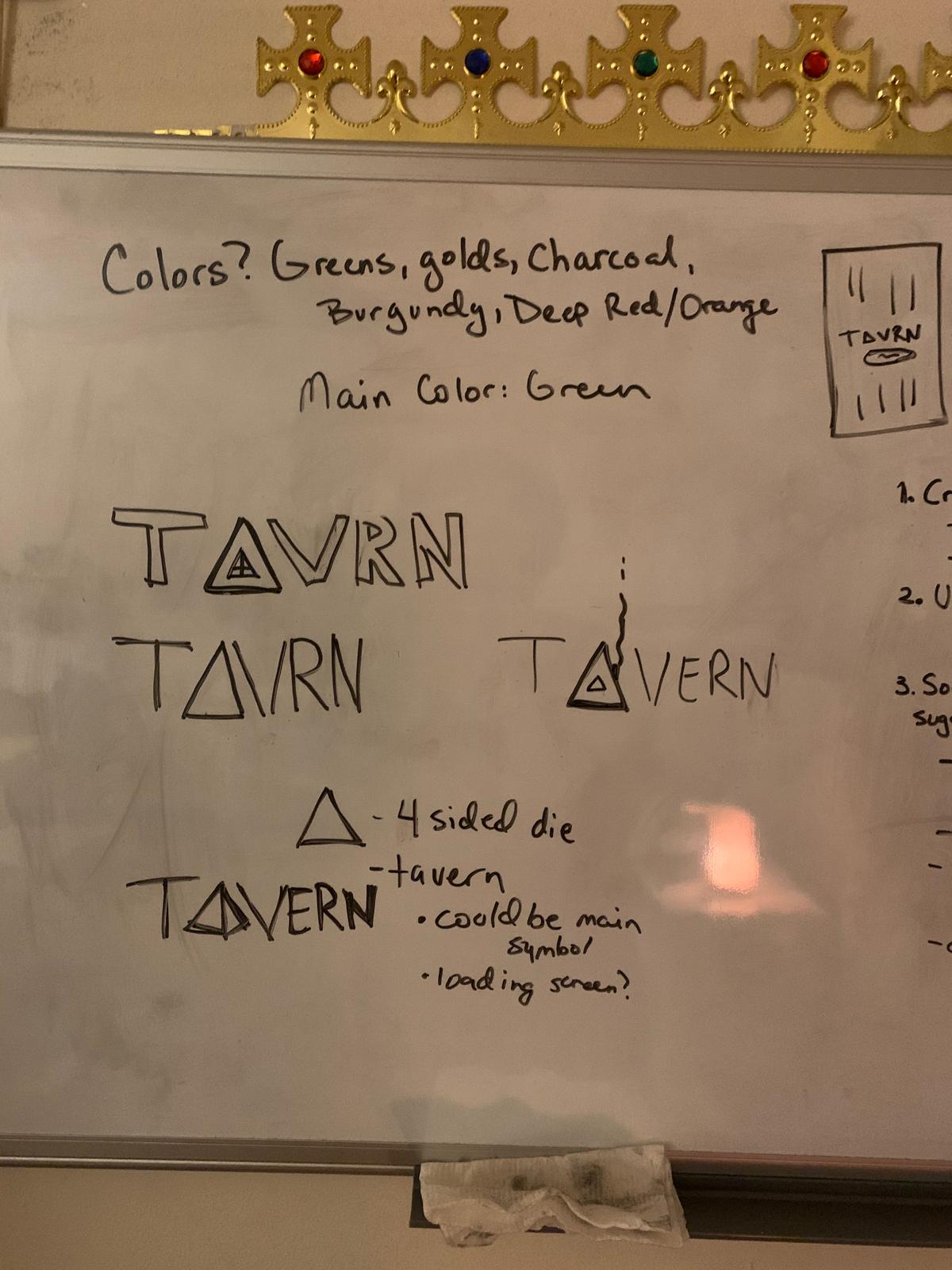
When conceptualizing Tavrn, I aimed to create an experience that truly immerses users in the ambiance of a classic fantasy tavern. The goal was for users to feel like they were stepping into a cozy, welcoming tavern where adventurers gather to share stories and embark on quests. To achieve this, the design utilized dark hues and dimly lit tavern corners, creating a warm and intimate atmosphere. The dark color palette was complemented by yellow accents, simulating the soft, flickering glow of candlelight and lanterns, emphasizing the sense of being in a well-loved, bustling tavern.
This design approach extended to every element of the platform, from the layout of user profiles to the navigation of game listings. The dark hues provided a visually soothing backdrop, allowing the yellow accents to highlight important features and calls to action, much like how warm lighting would draw attention to key areas in a physical space. The intention was to create a cohesive, immersive experience that not only visually appealed to users but also evoked the camaraderie and excitement of a traditional tavern gathering, making Tavrn a unique and engaging platform for connecting players and Dungeon Masters.
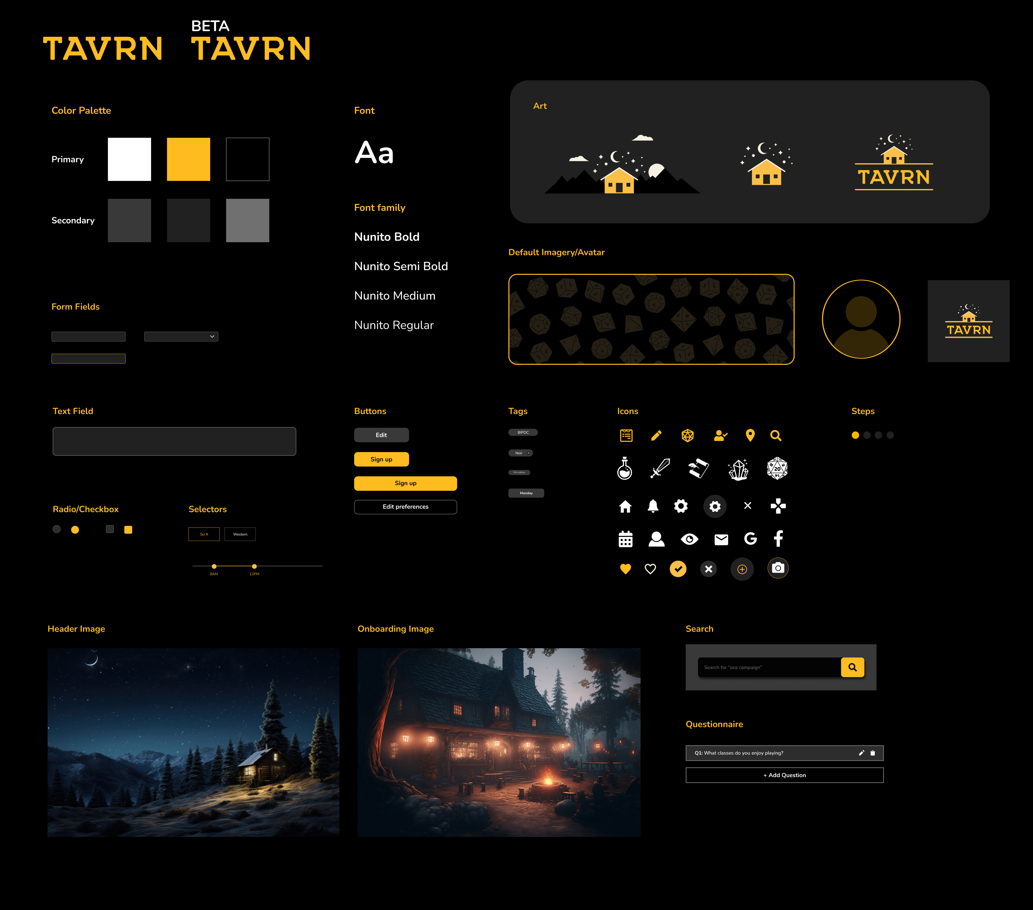
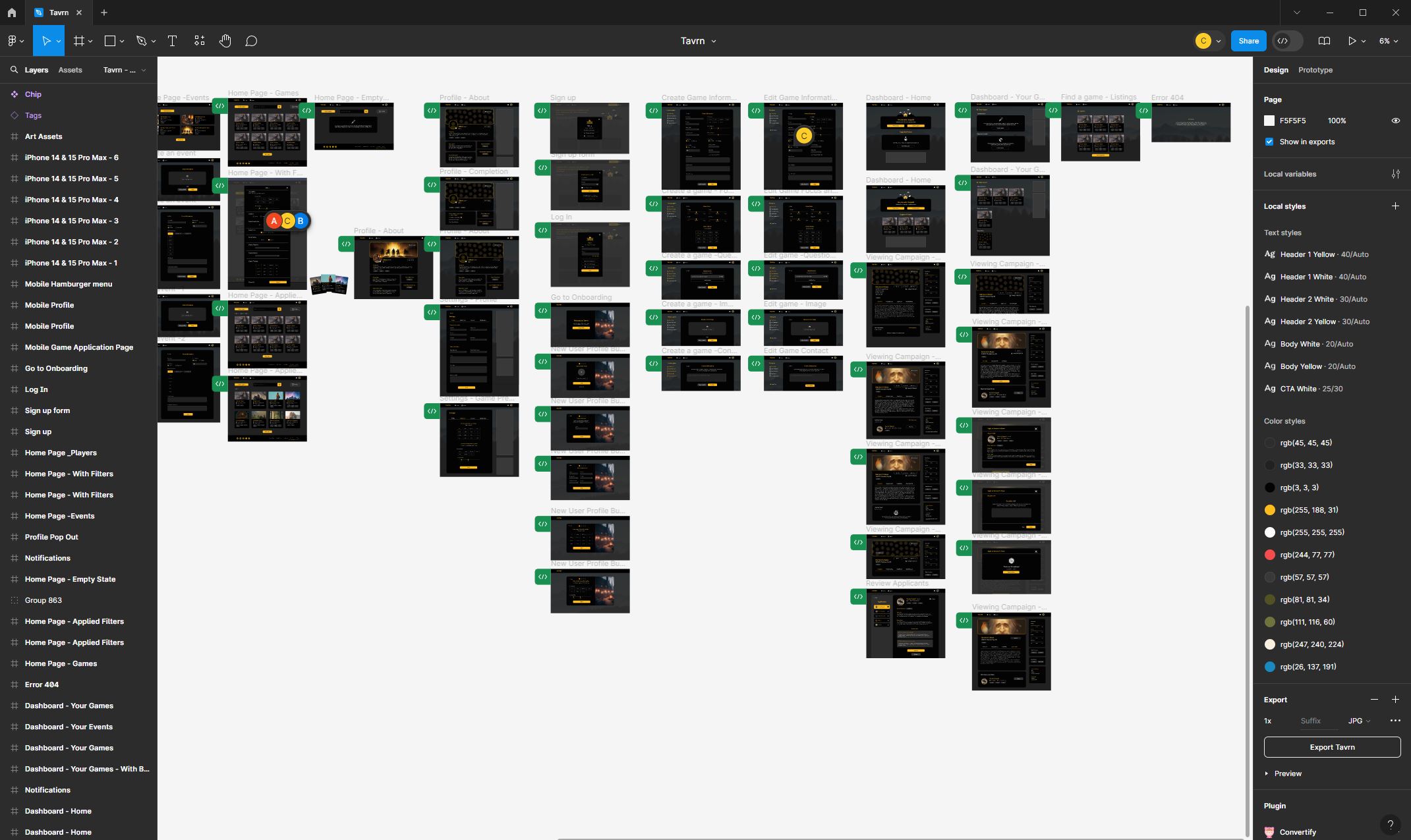
To bring Tavrn's visual and user experience to life, I used Figma as my primary design tool. Figma allowed me to create detailed, interactive prototypes that effectively communicated the look and feel I envisioned for the platform.
Throughout the development process, I maintained regular communication with the development team, participating in daily stand-ups and weekly sprint planning sessions. I provided detailed user stories and acceptance criteria to guide the developers in understanding the desired functionalities and user experiences. Additionally, I conducted usability testing to gather feedback on early prototypes, which I then used to refine and prioritize features.
I created a series of eye-catching and humorous ads tailored to platforms like Instagram, Facebook, and Twitter. I used a combination of witty taglines, vibrant visuals, and relatable scenarios to capture the interest of our audience. The ads were designed to drive traffic to our website and encourage sign-ups, leveraging social media's interactive nature to foster a sense of community and excitement around Tavrn. Through these targeted campaigns, we were able to effectively promote Tavrn and grow our user base.

Tavrn's launch was a huge success, and we've seen consistent growth since then. We've collaborated with others in the Dungeons and Dragons community to create a platform that is easy to use and helps players find games that fit their preferences. Our user base is growing rapidly, and we're excited to continue developing Tavrn and making it even better.
If you like what you see and want to work together, get in touch!
chanellemakesart@gmail.com